Alright, the library is open:

first 3 things that stick out to me that need improvement are:
- Anatomy
- Foreshortening
- Proportions
Anatomy and Proportions
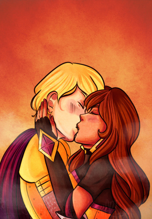
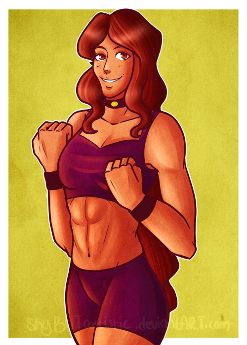
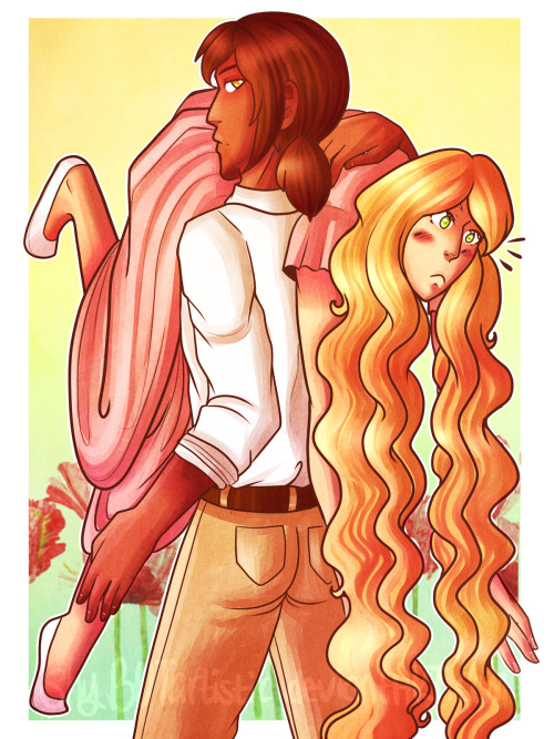
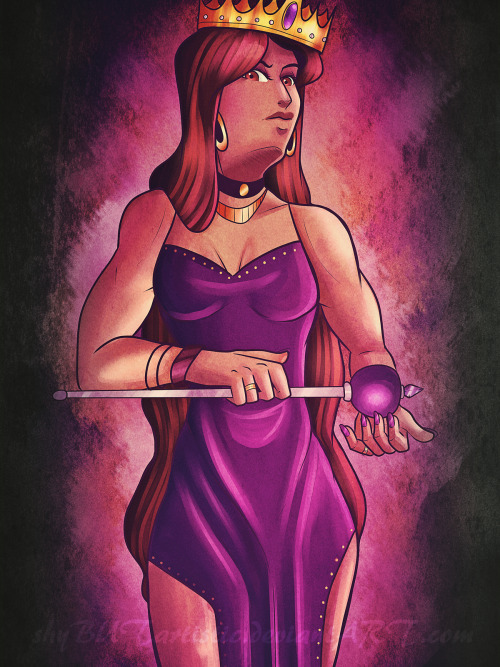
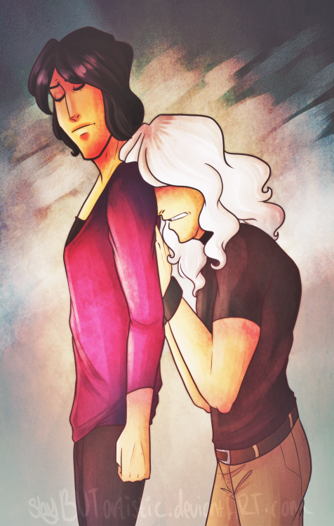
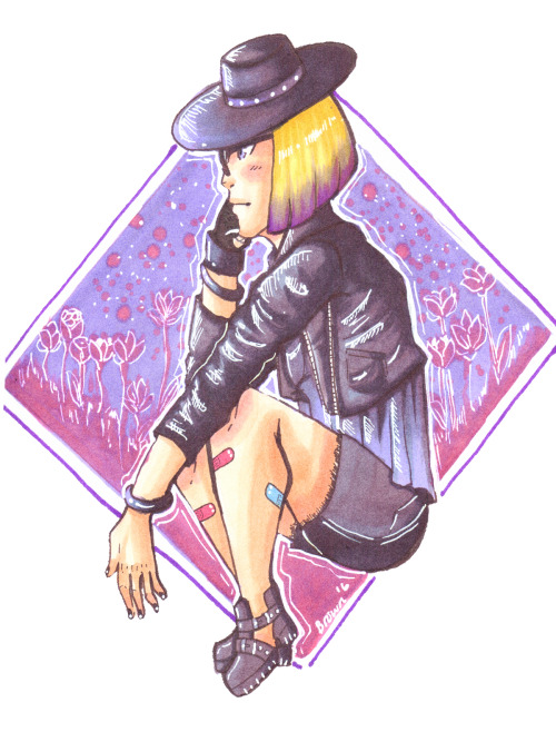
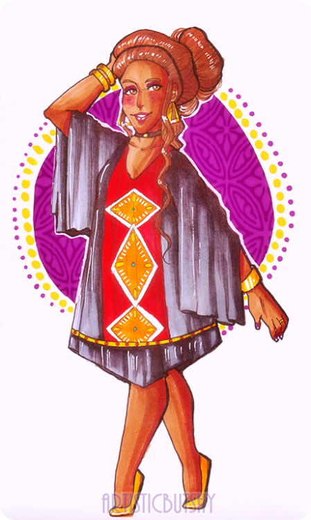
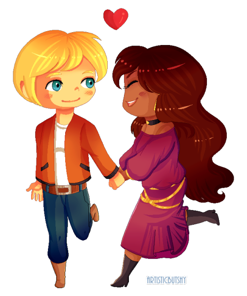
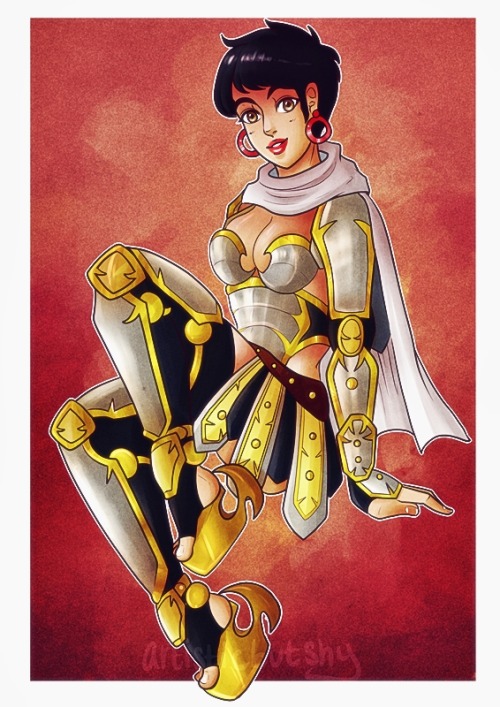
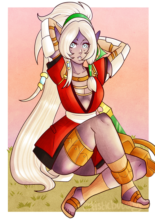
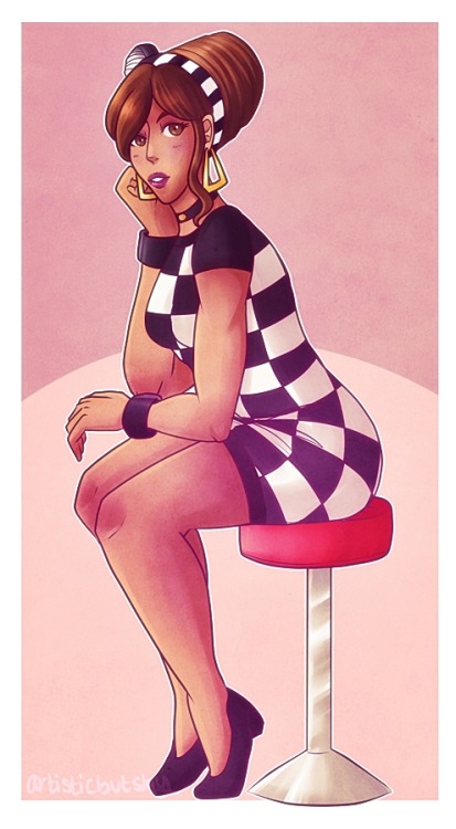
Overall, you have a nice understanding of how the human body is supposed to look like, it just needs some tightening. I think the best ones were the anatomy is not a problem are the first pic where they're kissing and the one with the knight with silver and gold armor. The ones that need the most work are the second one where the guy is carrying the girl, the one where he's carrying the girl over the shoulder, the girl crouching wearing leather, and the purple girl with the red kimono. If you look at them they seem a bit broken. In the first one the girl's left arm is waaayyy too long, if you follow the trajectory from her shoulder, to her elbow, to her hand, you will see the arm is way off of what it's supposed to look like. Next one, over the shoulder, here I think you have everything almost right except your angles are too broken. Look at the guy's arm, it doesn't follow the trajectory of the shoulder blades, the left shoulder is in 3/4 view, while the right shoulder is almost turned facing the camera. Also, the girl looks like she has a broken neck, is way too turned up, her body should also be a bit elevated for that angle to work. The girl crouching wearing leather is fine from the waist up, her legs, however, are wayyy too short! I know it's hard to estimate length in these type of poses but it does make it look weird when you don't get it right, her feet are also REALLY small. The purple girl with the red kimono has a really long torso, VERY long! If you sit like she's sitting you will see that your knee almost reaches your chin or collarbone. For the rest they seem pretty consistent but you do tend to make your heads either a little big or a little small to the body.
Foreshortening
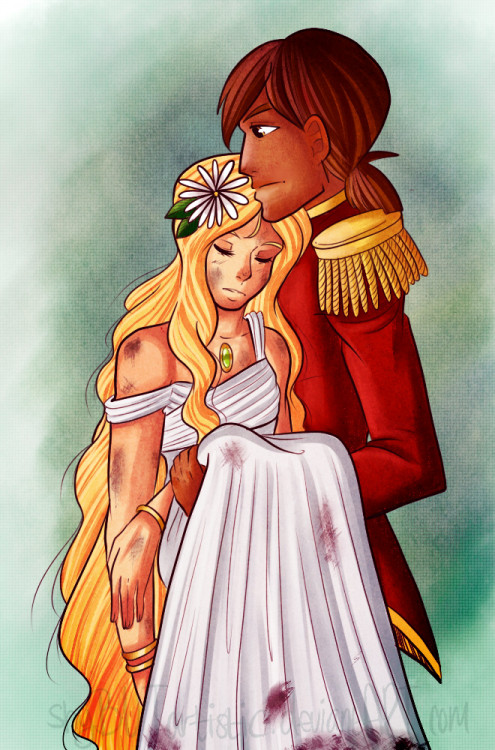
Okay this one will be quick, purple girl and the queen. I already talked about the purple girl, Now the queen. It looks like she has no neck and no jawline. I attribute this to your shading. If you would have brought up that shadow to contour the jaw better it would give this image a better look. The arms are a bit weird to me. I would move the right hand a bit to the outside of the body, not the inside, and raise the left hand a bit more. Find a mirror and try this pose out, just how you drew it, and you will see how awkward it feels, and then try it yourself, just how you would do it if you were her. I know foreshortening is difficult, but really study bodies and practice more, that's the only way to improve. You can even redraw these pictures and see how you would make it better.
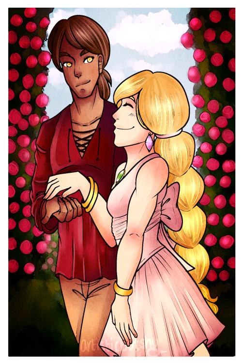
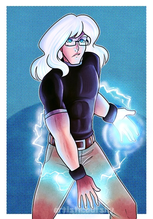
My favorite one is the last one! I think this is the most consistent. The anatomy is right, the proportions are good, the choice of colors is awesome, this is the definitely the most effective one out of all of them, along with the gold an silver knight! You did an awesome job with the lighting and the brilliancy of it, really cool!
The library is closed, officially!