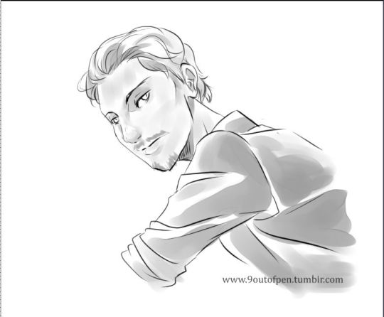
I think your art is really gorgeous, as long as you're happy with it, why the change?
And tbh, I LOVE the character designs in the thumbnails so heck yeah, I'd read it!
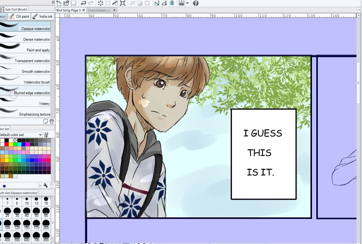
(I'd suggest either anime ace or perhaps komika for the lettering (they're fonts!), but blambot's got more than than those two, personal favourites of mine! Pick one that feels nice to you. People most often pick a font that's close to their handwriting, I think it gives an extra feel of being unique! :D
and sooorrryyy I feel like I'm just re-writing the tips Joanne gave you, but I wholeheartedly agree with them.)
Edit: And I'd read the comic even if it weren't in colour, just wanted to add that in. The pencils you've got on the thumbnail looks pretty awesome to me!