One issue I am having while reading this understand where one character is in relationship to another. Like a lot of it just feels like people just floating around in limbo and too many of the talking shots include close ups of only one character.
I feel dumb for using my own comic as an example but heck
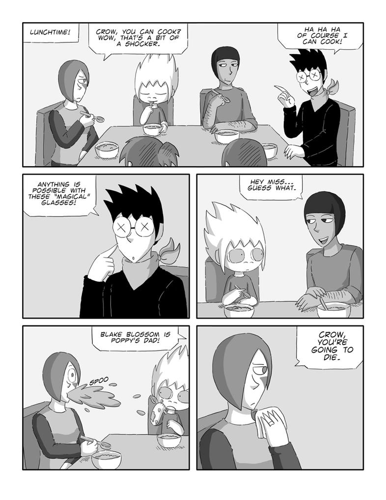
I wanted to show that how you place the character can give the view a better understand of where they are and who they are addressing when they are talking. This might include having a scene which establishes where character A, B, and C is to one another. Followed by having characters be placed in a way to show who is talking to who. You can tell that the man with the darker skin is addressing the woman and not the man with the glasses because of the establishment of where we know the characters are sitting.
Your page here
https://tapas.io/episode/658106
It is sort of hard to understand where exactly the grim guy is standing in relationship to the bar. From the way the bartender is looking, we might assume he's to the bartender's right. If that is the case, shouldn't the the young man be facing or turned left if he addressing the grim fellow? Or better yet, why not have a panel with both the young man and grim, so that we know who he is addressing. This may also involve cutting back on close up and super close shots and having more with multiple characters in them.
On another note, when making word bubbles make sure the pointed end is pointed at the character's mouth and not his chest or forehead.


