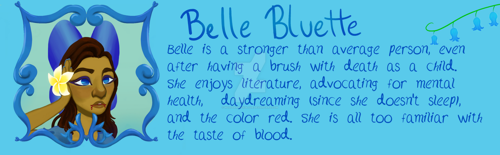
I wouldn't say it's a struggle to read -- I can tell what it says, no problem -- but it does feel a lil janky to me. Things like the b and h going in different directions, for example, or the f and h being weirdly scaled down to the same size as the t, or the o being so much larger than the circle shapes in letters like b or d. Looking at the word "with," the W and H look like completely different fonts to me. Overall I guess that's how I'd describe it -- it isn't difficult to tell what it says, but it does feel like it's made up of letters from slightly different fonts. That's just my impression though!
Possible alternatives, if you're able to download fonts (I'm not familiar with how gimp handles these things): Chewed Pen is a nice-looking, professional (and free!) font from Blambot that's both mixed caps and handwritten-looking. (Nightwatcher also fits those criteria but might be the wrong feel).
Or, if you want a bunch of alternate options, there's my favourite place to go window-shopping: DaFont.com! That link is for all the fonts submitted in the "handwritten" category, which are of varying degrees of quality (some of these are waaayyy too frilly for dialogue), and you'll have to keep an eye out for which ones are free and which you gotta pay to use the font commercially, but you might find something that works well for you! If you type in that "preview" box just above the first font in the list, and hit submit, you can see all the fonts in the list displaying your preview sentence, to make sure it looks good with your text.
(I handwrite my text by zooming in close and using a standard Times New Roman font as a guideline, but this takes a little time and I'm not sure if it's something you'd wanna do).